

Photo by Sincerely Media on Unsplash
How I created a Flipping form with less Javascript code
Easy way to create a flip-responsive form.


Hello everyone!
I am Idowu. An Upcoming Software Engineer.
I will be sharing how you can easily create a form that has a flipping animation with less JavaScript code
Html Code
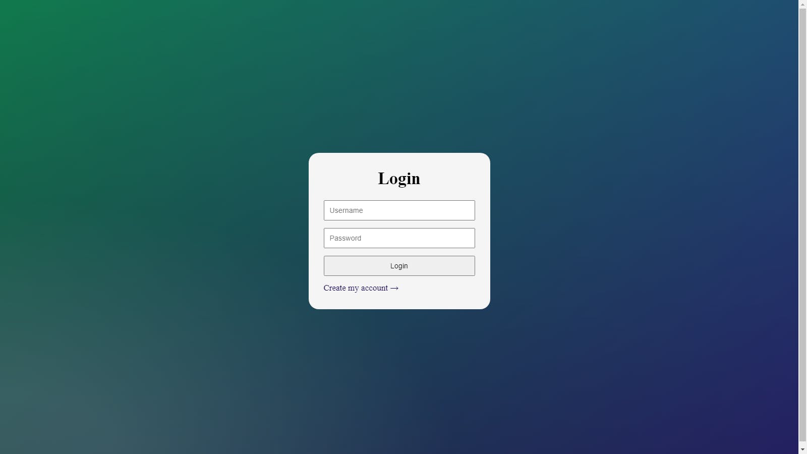
In the HTML file extension I will be creating a div element with a class flip-container and other necessary things:
<div class="flip-container">
        <div class="flipper" id="flipper">
            <div class="front">
                <h1 class="title">Login</h1>
                <form>
                    <input type="text" placeholder="Username" />
                    <input type="password" placeholder="Password" />
                    <input type="button" value="Login" />
                </form>
                <a class="flipbutton" id="loginButton" href="#">Create my account →</a>
            </div>

            <div class="back">
                <h1 class="title">Register</h1>
                <form>
                    <input type="text" placeholder="Username" />
                    <input type="password" placeholder="Password" />
                    <input type="button" value="Sign up" />
                </form>
                <a class="flipbutton" id="registerButton" href="#">Login to my account →</a>
            </div>
        </div>
    </div>
The CSS Code
In the CSS file extension I will be creating some necessary styling both for the form and the body at large:
/* Alignment styles for the form */

body,
html {
    height: 100%;
}


/* Body Design */

body {
    display: flex;
    justify-content: center;
    align-items: center;
    background: #1e0956;
    background: -moz-radial-gradient(0% 100%, ellipse cover, rgba(41, 103, 129, 0.4) 10%, rgba(139, 89, 8, 0) 40%), -moz-linear-gradient(top, rgba(57, 173, 219, .25) 0%, rgba(42, 60, 87, .4) 100%), -moz-linear-gradient(-45deg, #03681c 0%, #200d67 100%);
    background: -webkit-radial-gradient(0% 100%, ellipse cover, rgba(104, 128, 138, .4) 10%, rgba(138, 114, 76, 0) 40%), -webkit-linear-gradient(top, rgba(57, 173, 219, .25) 0%, rgba(42, 60, 87, .4) 100%), -webkit-linear-gradient(-45deg, #200d67 0%, #200d67 100%);
    background: -o-radial-gradient(0% 100%, ellipse cover, rgba(16, 128, 177, 0.5) 10%, rgba(138, 114, 76, 0) 40%), -o-linear-gradient(top, rgba(57, 173, 219, .25) 0%, rgba(42, 60, 87, .4) 100%), -o-linear-gradient(-45deg, #03681c 0%, #200d67 100%);
    background: -ms-radial-gradient(0% 100%, ellipse cover, rgba(104, 128, 138, .4) 10%, rgba(138, 114, 76, 0) 40%), -ms-linear-gradient(top, rgba(57, 173, 219, .25) 0%, rgba(42, 60, 87, .4) 100%), -ms-linear-gradient(-45deg, #03681c 0%, #200d67 100%);
    background: -webkit-radial-gradient(0% 100%, ellipse cover, rgba(104, 128, 138, .4) 10%, rgba(138, 114, 76, 0) 40%), linear-gradient(to bottom, rgba(57, 173, 219, .25) 0%, rgba(42, 60, 87, .4) 100%), linear-gradient(135deg, #03681c 0%, #200d67 100%);
}


/* Flip Code Start here */

.flip-container {
    perspective: 1000;
}

.flipper {
    padding: 30px;
    width: 300px;
    height: 250px;
    position: relative;
    background: #f5f5f5;
    -webkit-border-radius: 20px;
    -moz-border-radius: 20px;
    border-radius: 20px;
    transition: 0.6s;
    transform-style: preserve-3d;
}


/* The Flipping rotation */

.front,
.back {
    /*background-color: rgba(0,0,0,.3);*/
    position: absolute;
    padding: 10px 30px;
    top: 0;
    left: 0;
    right: 0;
    backface-visibility: hidden;
}

.front {
    z-index: 2;
    /* for firefox 31 */
    transform: rotateY(0deg);
}

.back {
    transform: rotateY(180deg);
}

.flip {
    transform: rotateY(180deg);
}

input {
    width: 100%;
    margin-bottom: 15px;
    height: 40px;
    box-sizing: border-box;
    padding: 10px;
}

.title {
    text-align: center;
}


/* The FlipButton of the form */

.flipbutton {
    color: #15054e;
    text-decoration: none;
    text-align: left !important;
}
The JS code
So now this form is created and the next thing is to call the function for the flipping to start working. In the JavaScript file extension, you will be needing only this function:
var loginButton = document.getElementById("loginButton");
var registerButton = document.getElementById("registerButton");

loginButton.onclick = function() {
    document.querySelector("#flipper").classList.toggle("flip");
}

registerButton.onclick = function() {
    document.querySelector("#flipper").classList.toggle("flip");
}
We have successfully created a flipping form with less Javascript.
Were these resources helpful? If yes drop a comment.