

Photo by Moritz Kindler on Unsplash
Create a Wall Clock using JavaScript
How I created a clock using JavaScript...


Hello there!
I will be sharing how you can achieve creating a wall clock using HTML, CSS and JavaScript...
In the HTML file extension
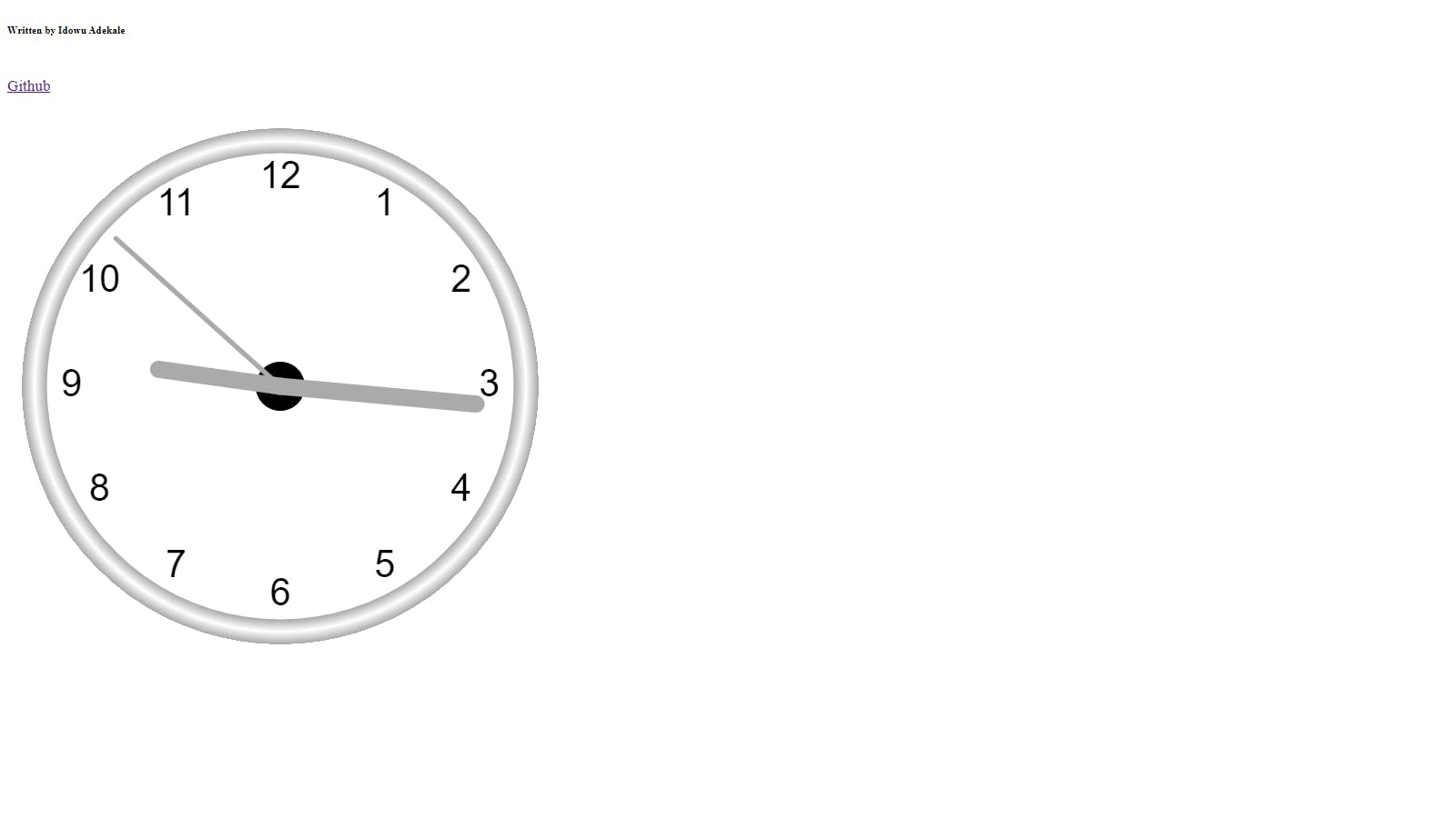
I will be creating a CANVAS element with a width of 600 and a height of 600 so that it will be accurate and balanced, along with some necessary input I will be adding:
<div class="container">
        <div class="producer">
            <div class="pre">
                <h6>Written by Idowu Adekale</h6>
            </div>
            <br>
            <div class="link" onclick="myFunction()">
                <a href="https://github.com/idowuadekale" target="_blank">Github</a>

            </div>
        </div>
        <div id="link"></div>

        <br>
        <div class="can" id="loader">
            <canvas id="canvas" width="600" height="600"></canvas>
        </div>
        <br>
        <br>
    </div>

Successfully, we just only created a Canvas element but the real work is the JScript involved and now We will be adding the JavaScript before the Styling is been done to see the clock or you can go ahead and add the CSS no worries it will still work as expected so I will be creating the JS code:
In the JavaScript File Extension:
At first, we will be creating a function to draw the clock face, the clock number and the clock Time. Then, lastly, the clock hand comprising of the hour, minutes and seconds.
// ######################### Clock code begin

var canvas = document.getElementById("canvas");
var ctx = canvas.getContext("2d");
var radius = canvas.height / 2;
ctx.translate(radius, radius);
radius = radius * 0.90
setInterval(drawClock, 1000);

function drawClock() {
    drawFace(ctx, radius);
    drawNumbers(ctx, radius);
    drawTime(ctx, radius);
}

function drawFace(ctx, radius) {
    var grad;
    ctx.beginPath();
    ctx.arc(0, 0, radius, 0, 2 * Math.PI);
    ctx.fillStyle = 'white';
    ctx.fill();
    grad = ctx.createRadialGradient(0, 0, radius * 0.95, 0, 0, radius * 1.05);
    grad.addColorStop(0, '#aaa');
    grad.addColorStop(0.5, 'white');
    grad.addColorStop(1, '#aaa');
    ctx.strokeStyle = grad;
    ctx.lineWidth = radius * 0.1;
    ctx.stroke();
    ctx.beginPath();
    ctx.arc(0, 0, radius * 0.1, 0, 2 * Math.PI);
    ctx.fillStyle = '#000';
    ctx.fill();
}

function drawNumbers(ctx, radius) {
    var ang;
    var num;
    ctx.font = radius * 0.15 + "px arial";
    ctx.textBaseline = "middle";
    ctx.textAlign = "center";
    for (num = 1; num < 13; num++) {
        ang = num * Math.PI / 6;
        ctx.rotate(ang);
        ctx.translate(0, -radius * 0.85);
        ctx.rotate(-ang);
        ctx.fillText(num.toString(), 0, 0);
        ctx.rotate(ang);
        ctx.translate(0, radius * 0.85);
        ctx.rotate(-ang);
    }
}

function drawTime(ctx, radius) {
    var now = new Date();
    var hour = now.getHours();
    var minute = now.getMinutes();
    var second = now.getSeconds();
    //hour
    hour = hour % 12;
    hour = (hour * Math.PI / 6) +
        (minute * Math.PI / (6 * 60)) +
        (second * Math.PI / (360 * 60));
    drawHand(ctx, hour, radius * 0.5, radius * 0.07);
    //minute
    minute = (minute * Math.PI / 30) + (second * Math.PI / (30 * 60));
    drawHand(ctx, minute, radius * 0.8, radius * 0.07);
    // second
    second = (second * Math.PI / 30);
    drawHand(ctx, second, radius * 0.9, radius * 0.02);
}

function drawHand(ctx, pos, length, width) {
    ctx.beginPath();
    ctx.lineWidth = width;
    ctx.lineCap = "round";
    ctx.moveTo(0, 0);
    ctx.rotate(pos);
    ctx.lineTo(0, -length);
    ctx.stroke();
    ctx.rotate(-pos);
}
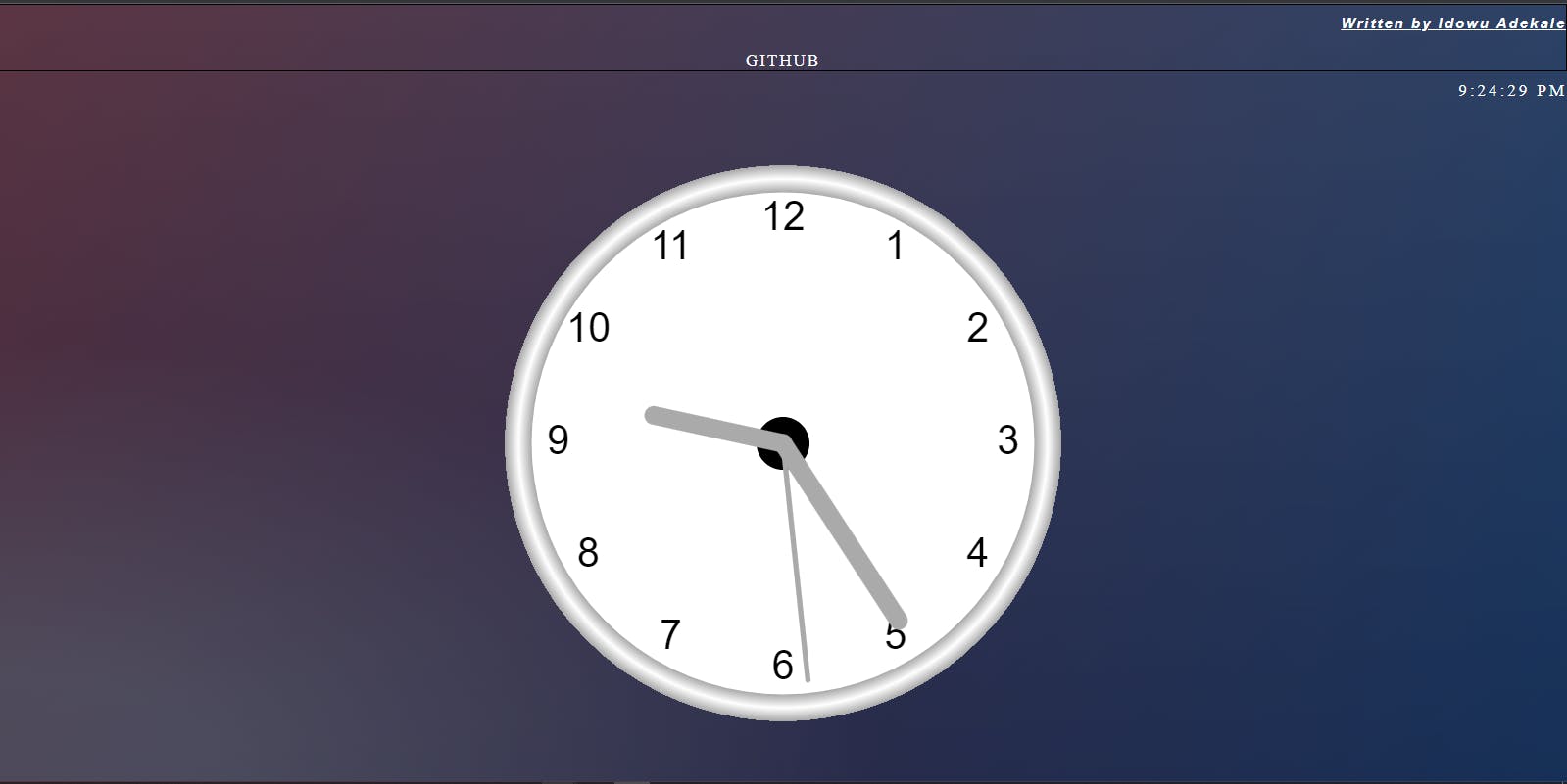
What a success! Now we will be adding CSS Styling to the code to make it more attractive and insightful.
In the CSS file Extension:
Paste the following code and let's see what our code looks like...
* {
    margin: 0;
    padding: 0;
}

body {
    background: #092756;
    background: -moz-radial-gradient(0% 100%, ellipse cover, rgba(104, 128, 138, .4) 10%, rgba(138, 114, 76, 0) 40%), -moz-linear-gradient(top, rgba(57, 173, 219, .25) 0%, rgba(42, 60, 87, .4) 100%), -moz-linear-gradient(-45deg, #670d10 0%, #092756 100%);
    background: -webkit-radial-gradient(0% 100%, ellipse cover, rgba(104, 128, 138, .4) 10%, rgba(138, 114, 76, 0) 40%), -webkit-linear-gradient(top, rgba(57, 173, 219, .25) 0%, rgba(42, 60, 87, .4) 100%), -webkit-linear-gradient(-45deg, #670d10 0%, #092756 100%);
    background: -o-radial-gradient(0% 100%, ellipse cover, rgba(104, 128, 138, .4) 10%, rgba(138, 114, 76, 0) 40%), -o-linear-gradient(top, rgba(57, 173, 219, .25) 0%, rgba(42, 60, 87, .4) 100%), -o-linear-gradient(-45deg, #670d10 0%, #092756 100%);
    background: -ms-radial-gradient(0% 100%, ellipse cover, rgba(104, 128, 138, .4) 10%, rgba(138, 114, 76, 0) 40%), -ms-linear-gradient(top, rgba(57, 173, 219, .25) 0%, rgba(42, 60, 87, .4) 100%), -ms-linear-gradient(-45deg, #670d10 0%, #092756 100%);
    background: -webkit-radial-gradient(0% 100%, ellipse cover, rgba(104, 128, 138, .4) 10%, rgba(138, 114, 76, 0) 40%), linear-gradient(to bottom, rgba(57, 173, 219, .25) 0%, rgba(42, 60, 87, .4) 100%), linear-gradient(135deg, #670d10 0%, #092756 100%);
}

.can {
    text-align: center;
    margin-top: 30px;
}

.producer {
    align-items: center;
    justify-content: center;
    text-align: center;
    border: 1px solid black;
    border-image: auto;
    letter-spacing: 2px;
}

h6 {
    text-align: right;
    letter-spacing: 2px;
    font-size: 15px;
    color: #fff;
    font-family: sans-serif;
    font-style: italic;
    text-decoration-line: underline;
    margin-top: 10px;
}

h6:hover {
    text-transform: uppercase;
    color: #222;
    margin-top: 12px;
}

#link {
    color: #fff;
    letter-spacing: 3px;
    text-align: right;
    margin-top: 10px;
}

#link:hover {
    font-size: 25px;
    cursor: crosshair;
    color: #222;
}

a {
    color: #fff;
    text-transform: uppercase;
    text-decoration: none;
}

a:hover {
    color: #000;
    background: transparent;
    font-size: bolder;
}

@media screen and (max-width: 991px) {
    #canvas {
        width: 100%;
    }
    .container {
        line-height: 10px;
    }
    .pre {
        margin-bottom: 25px;
        margin-top: 35px;
    }
}
Hoops! Don't forget to leave a comment?